SEO ranking graphs are one of the most important tools in any SEO strategy.
Not because they can boost your ego when you see big ranking boners, but because the data and patterns contain highly valuable information about your SEO strategy.
When properly analyzed, a ranking graph can completely reshape your SEO game plan.
In this guide, I will show you exactly how I interpret ranking graphs with some real examples.
You’ll learn how to identify healthy and unhealthy ranking patterns, Google dance impacts, and how to know when the time has come for adding links into your SEO strategy.
What Is a Ranking Graph?
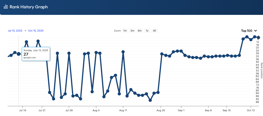
A ranking graph is a visual representation of how a specific keyword moves up and down for a given web page in a search engine like Google.
Typically, rank tracking tools will gather data daily and keep track of it so that you can see how and when changes happen.
The graph simply makes it easier to visualize those changes rather than having to look at a long list of numbers.
The X-axis on a graph represents time and is usually listed as one-day intervals, while the y-axis represents the keyword position on a given day.
I always recommend that people pay close attention to ranking graphs because they help you better identify trends and changes over time, rather than simply looking at a few data points that don’t tell much of a story.
These graphs can show a wide variety of patterns, like:
- Healthy upward trend
- Normal Google dance
- Unhealthy reaction to algorithm updates
- New Google penalty
- Penalty recoveries
- Reactions to on-page and off-page SEO strategies
Here is an example of what a graph looks like.
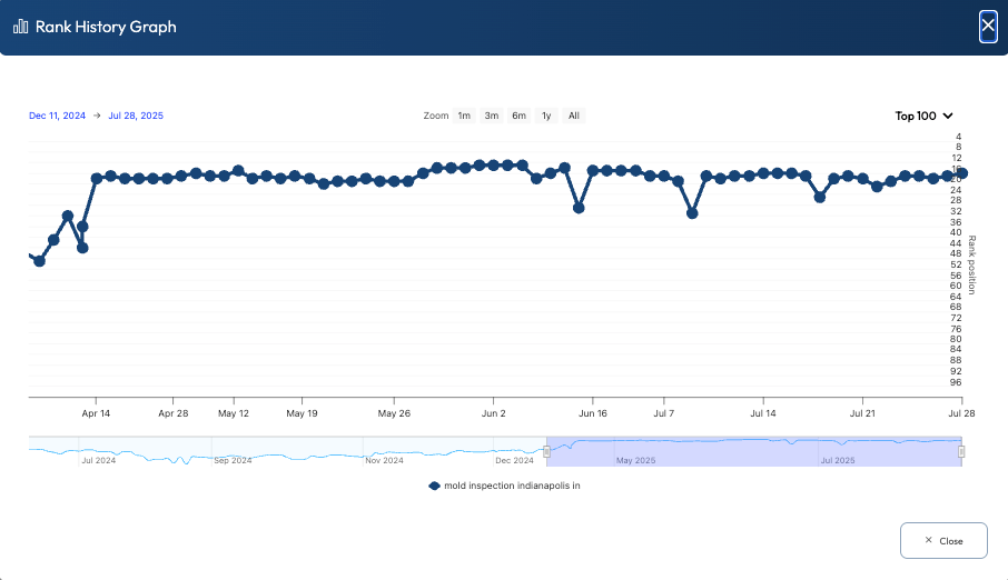
What Should Be Included in a Ranking Graph
I already mentioned that a ranking graph includes time on the x-axis and the ranking position on the y-axis.
But you want to have a few more features in a ranking graph to help make your analysis a bit easier.
The first thing you need is the ability to zoom in on both the timeline and ranking axis.
Here’s why that’s important.
If you look at a graph with 6 months or more of data, then all those data points end up squashed together, making it more difficult to see changes over time.
Similarly, if you have a ranking graph that focuses only on the full range from position 1 to 100, then a graph where most of the rankings are in the top 10 will look almost like a straight line, even if there are subtle changes.
Being able to zoom in on the time and ranking axis also allows you to focus on very specific sections where you know there may have been activity due to new links or Google updates, for example.
Hint: I have another tool to share with you shortly that makes tracking the impacts of links a lot easier.
It’s also very helpful if you can overlay graphs for multiple keywords. This approach allows you to compare ranking changes between related and unrelated keywords to see if there are any patterns that may help you in making strategic SEO decisions.
Tools That Make Rank Graph Analysis Easier
There are countless tools out there that help track your rankings over time, but Xagio makes it so much easier than anything else.
It’s not filled with countless features that are pointless shiny objects; instead, it provides a highly focused view for those keywords that are actually part of your SEO strategy.
See, everything in SEO starts with a solid keyword research foundation, and Xagio provides that with Project Planner.
Once you have your ideal keyword clusters identified and everything topically grouped for maximum SEO benefit, you can then simply select the keywords you want to track and send them directly to Xagio’s Rank Tracker.
The rest is automated, and the system will check each keyword’s ranking daily and record the data for you.
Healthy vs. Unhealthy Ranking Graphs
I want to now show you what a healthy and unhealthy rank graph looks like and what it could mean for your SEO strategy.
Healthy Graphs
Healthy ranking graphs usually look boring, and that’s a good thing.
You’ll typically see a gradual upward trend over weeks or months as Google tests your page, gathers engagement signals, and gains confidence in the content.
Along the way, there will be minor fluctuations, but they should revolve around a consistent trajectory rather than swinging wildly day to day.
This kind of pattern often shows that your page matches search intent, the content is strong enough to compete, and your link profile isn’t setting off alarms.
Even when you see small dips, the graph tends to recover quickly and continue trending in the right direction.
If you’re seeing this, the conservative move is usually patience and incremental improvements, not drastic changes.
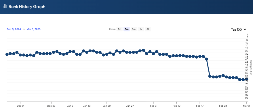
Unhealthy Graphs
Unhealthy graphs are the ones that make you check the date and ask, “What did I do?”
Sharp drops or spikes are usually the first warning sign, especially when they happen overnight and don’t stabilize within a few days.
Long periods of instability or stalling can also be a problem, because it often means Google can’t confidently place the page, or it keeps getting outcompeted.
These patterns can point to weak content, mismatched intent, poor internal linking, or a link profile that’s either too thin or sending risky signals.
If the timing lines up with a known update, it may be algorithm-related, but the fix is still the same: identify what changed, strengthen the page, and clean up anything suspicious off-page.
But you have to be careful.
I’ve seen many charts like the one below that completely recover without any action, just a few weeks later.
My suspicion is that Google tries to catch SEOs out who panic and suddenly remove backlinks. That can be an even bigger signal to Google that someone is trying to “game” the system.
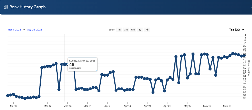
Understanding the Google Dance
The Google Dance is the short-term volatility you see when Google is still deciding where a page belongs in the results.
It’s extremely common for brand-new sites, but it also happens when expired domains get repurposed.
It happens because Google tests your page against different competitors, gathers engagement signals, and adjusts its understanding of intent and relevance.
In ranking graphs, the dance shows up as noticeable up-and-down movement over days or weeks, often without any changes you made on the site.
You’ll also see it during indexation shifts, like when internal links change, canonicals get updated, or Google starts associating the page with a slightly different set of keywords.
Algorithm updates can amplify the dance across many keywords at once, which is a helpful clue that the volatility isn’t “your page is broken,” it’s “the SERP is being reshuffled.”
The key is to watch the trendline, not panic over individual points.
Here’s an example of what that Google dance can look like.
Unfortunately, there’s no clear timeline for how long this can last.
I’ve seen new websites dance around for a couple of weeks, and then jump to the top 3 and stay there.
And then I’ve had sites where Google wanted to stay on the dancefloor for a few extra songs, and it lasted a couple of months.
The important thing is not to read too much into it. Be patient, let things settle, and work on other projects while you wait.
Diagnosing Issues from Ranking Graph Behavior
Ranking graphs don’t just show movement, they often hint at why it’s happening.
Erratic swings can suggest unstable signals, like low-quality or mismatched links, weak engagement, or a SERP that’s being reshuffled by an algorithm update.
A sharp drop that doesn’t recover may point to a bigger issue, such as a technical change, indexation problem, or a link profile that suddenly looks unnatural.
You might also have to look for any manual penalties applied in Google Search Console.
If only one page tanks while others stay steady, the problem is likely page-specific, like intent mismatch, thin content, or UX friction.
If many pages move together, you’re probably looking at a sitewide issue, a broader competitor shift, or an update-driven volatility wave.
What I generally recommend is to check for any event correlation.
Here’s what I mean.
You should always keep a journal of what’s happening on your site, including: new links built, content edits, title changes, internal link changes, redirects, plugin updates, or technical fixes.
If one of these aligns with a sudden drop in rankings, then you might have a smoking gun.
What you don’t want to do is overreact, especially if you think a new link may have caused the issue.
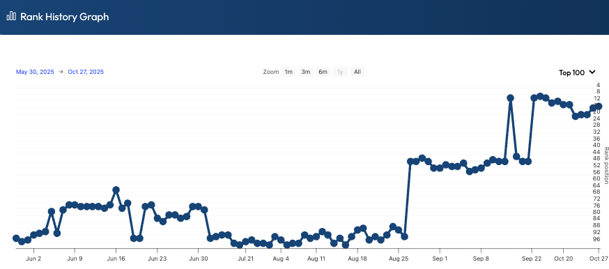
Take a look at the next screenshot.
You can see a sudden drop from page one and then about a month of bouncing around.
This happened to one of my sites after adding one link.
What did I do?
Nothing! I waited a few weeks and saw that things recovered, and then jumped to the top of page 1 without any new links or changes to the page.
And this leads me to an important next topic.
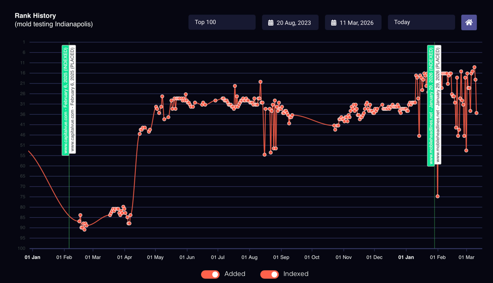
Tracking The Impact Of Your Backlinks
Overlaying backlink publishing dates on your ranking graphs is one of the easiest ways to stop guessing and start making confident SEO decisions.
Without an overlay, you’ll see a jump or drop and assume it was your link work, when it could have been a Google shuffle, a competitor change, or pure volatility.
When you mark the exact date a link went live (and when it was indexed), you can see whether rankings moved after the link became eligible to influence the SERP.
That’s the key detail most people miss, because a published link that isn’t indexed yet is basically a “nice idea,” not an SEO signal.
It’s also important to overlay natural links you didn’t build, because those can explain ranking movement that otherwise looks “mysterious.”
Once you can see every link event on the same timeline as your rankings, you quickly learn which link types and sources move the needle, which do nothing, and which correlate with negative movement.
That’s exactly the problem I solved with my tool LinkSheets, by visually showing the crossover between ranking history and backlink build/indexation dates.
How LinkSheets Makes Rank Analysis Easier

LinkSheets combines rank tracking with backlink tracking so you can see ranking history alongside your backlink build dates and indexation status in one place.
It automatically checks whether backlinks are indexing in Google and highlights these events on ranking charts, so you’re not manually rechecking links like it’s 2008.
It also includes “Link Power” scoring to help you compare the strength of your links, plus client-ready reporting graphs that clearly show impact over time.
Not only do you get confirmation about what parts of your SEO strategy are working, but you can also share that information to prove your value to clients.
The result is faster diagnosis, better link decisions, and cleaner reporting without a hint of a convoluted spreadsheet that requires a math genius brain to interpret.
Simply add your backlink info and target keywords to a campaign, and LinkSheets takes care of everything else.
It even discovers natural links for you and adds them to the chart.
Here’s what the impact of a few tracked backlinks looks like on the chart.
The more links you need for a project, the more valuable this tool becomes.
Get A Free LinkSheets Account Now
Ranking graphs aren’t just “up or down” lines; they’re signals that tell you when to stay patient, when to investigate, and when to push harder.
When you know what healthy trends look like, how the Google Dance shows up, and how to diagnose erratic behavior, you stop reacting emotionally and start making decisions with evidence.
And overlaying link publish and index dates (plus natural links) lets you see cause-and-effect instead of coincidence.
LinkSheets automates this process by tracking your links, checking indexation, and plotting events directly on your ranking charts.
Create a free LinkSheets account and start seeing exactly which links move rankings and which ones are just “nice ideas.” Get your first campaign set up in minutes and make every link decision measurable.